Andrew McMurray - Artist Study
Andrew McMurray is a freelance graphic designer/video editor, self-educated in computer-based 3D graphic design and editing. He puts 3D animations in real life scenarios in a lot of his YouTube clips. On the right is one of his videos, which shows a great amount of animation, cinematography, 3D motion tracking and hours of rendering.
He is inspired by video games, but rarely takes inspiration from films. His videos are very creative which is why I really liked his work.
Part of the beauty of animation is that there are endless possibilities, however figuring out how to do them and accomplish them convincingly is what makes it hard work, but also very exciting.
Part of my project will be using these same techniques to create an animation of my own, based more on his animation of lego figures, as shown below:
Analysis of 'Lego Invasion'
I have chosen different clips from the video to analyse:

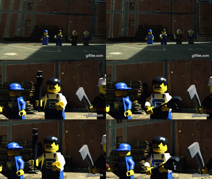
Here is an example of animated people superimposed onto a real video background. It is a handheld camera shot, and so the 3d figures must and will have been 3D camera tracked, whereby the background footage is analysed by a computer for camera movements, and that information is brought into Cinema 4D, where the models are rendered.
The camera in Cinema 4D replicates the movements done by the real camera, using this motion track data, that was created by looking at significant pixels and where they move in relation to each other. This helps the software know if the camera was rotated, panned, or zoomed in.
The lighting would have been matched to that in the video, which in this case is a strong sunlight, giving quite hard shadows. The bodies appear to have small amounts of reflection also - an example is the reflections on the man holding the spanner.
From the animation point of view, the figure would have been rigged, and then the people's hands and body parts would have been animated by logging movements at keyframes. I like this clip because McMurray goes into lots of detail, especially when the figure holding the spanner catches it in his hand, it reacts to the momentum by moving slightly, rather than just locking into his hand without the hand moving.

This clip, (1:47 to 1:52 in the youtube video, better quality than this GIF) is what inspired me to create shadows on walls, rather than just shadows on floors, in my animation. I liked the way McMurray has used the big wall really well, by placing objects all over it. The webs look really good, and are tracked very well for this handheld shot. There is reflection on the spiders, which adds to the realism as there is sun in the environment.
The handheld camera isn't too shaky either, probably held with a jib or some sort of weight to stabilize it. The authority of the spiders, even though they are just childrens toys, is not only enforced by their size, but also the fact they crawl in from the top of the shot, rather than just appearing their already. The crawling legs are very realistic as well, which almost makes you forget it is just enlarged Lego, let alone animation, especially in the context of the entire video.

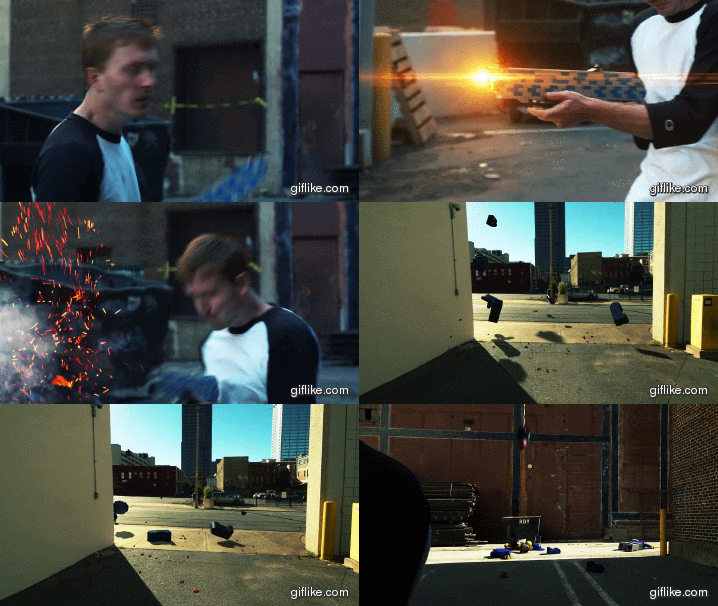
This gunshot clip is packed with different techniques. Firstly, the animation of a breaking person is really interesting, as it uses a physics engine to simulate this, rather than animating each body part individually and manually, which is similar to how the Lego bricks drop in my animation. Also, the shadows are almost identical to those in the environment, and again the 3D camera track is very accurate. I like the fact that everything is exaggerated in this shot, nothing is understated, because, it is animation: there are no limits as such, and it adds to the intensity of the scene so there is no reason not to. The light flares coming out of the gun, followed by sparks, smoke and an explosion, are all very exciting when combined, and happen very quickly, but catch the viewers attention, as the flash almost takes up the whole screen for a few frames. The Lego 'blood' is also a nice touch, however I won't be adding this to my animation, but it is interesting to see bigger objects and smaller objects using a physics engine together, i.e. bouncing off each other and hitting the floor together. The colours appear very cinematic, and I would like to mimic the look in my animation.
