top of page

KISHAN THAKRAR
A LEVEL ART PHOTOGRAPHY PORTFOLIO
Cambridge
I recently visited Cambridge and took photos, most of which are not directly linked to the theme of light, however I manipulated many of the colours and tones in the photos to create more digitally edited light in scenes, which is using light to add interest to the photos digitally instead of naturally. I created light leaks and colour filters from scratch in Photoshop which I have used to edit these photos.


I decided to make some photos black and white, to concentrate the viewer on the tone of the bricks on the buildings, or to add depth to a more dull-coloured photograph.


The image above was quite neutral colour-wise, so I made it black and white, with deep blacks to give lots of contrast, which also gave the image a HDR look, enhancing the strength of the wooden bridge and giving the water a much sharper look.


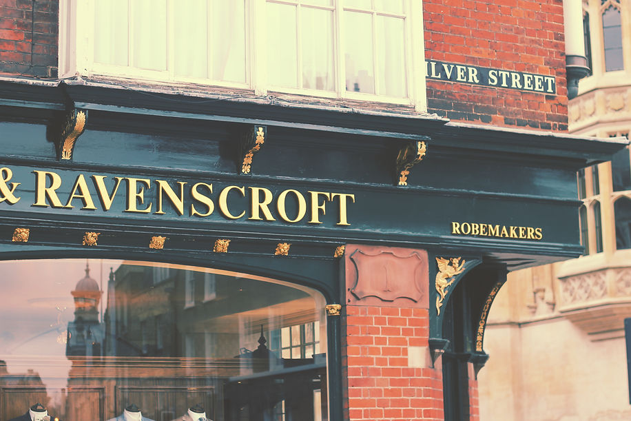
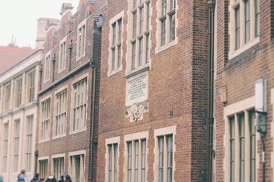
I increased the Red in the curves layer of the image to the left, and added a warm yellow overlay on top in Photoshop, to bring out the red brick and give the image a warmer temperature, which made the sky a yellow colour rather than its original white colour. I chose to leave this yellow instead of masking it out as it was quite an unusual colour that complimented the building, with just a single tone throughout the sky.


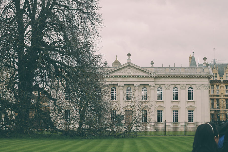
The image above needed straightening, so in Photoshop I straightened the image based upon the corner of the wall, and the line appears to be very straight, almost as if another photo has been added onto the side. I increased the contrast and sharpness slightly to enhance the tone in the brick.


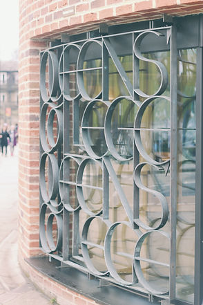
In the image below, I wanted to create a tilt-shift style effect so that the image would be focussed on one part of the repetetive pattern on the side of the building. I used the tilt-shift effect in photoshop and added distortion to the blur for a more realistic look. I also wanted to enhance the age of the buildings by bringing out the rotting and dirt in the stonework, so I increased the contrast and masked it to only affect the stone of the building, with a layer mask. I edited the colour of the lighter tones in the image by increasing the yellow in an adjustment layer, and also increasing the greens to bring out the green water stains on the building. I also increased the vibrancy to exaggerate all of these colours which gave the final image below:
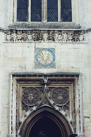
The photo to the left did not need much editing, I only added a soft colour overlay to part of the image, by painting a light orange/blue gradient with a soft brush on a layer above the photo, and setting the Blending Mode to Screen.
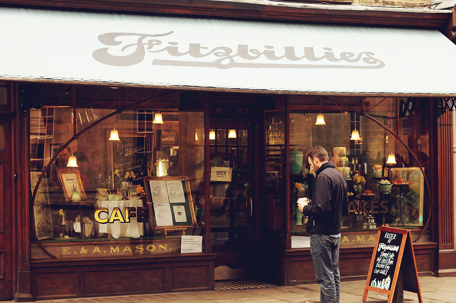
I captured the image from an angle so that an interesting reflection would be seen as a blur in the glass on purpose, because the light bokeh gives the image a lot more interest than just inside the shop window. I aligned the shot so that the reflection would not be too obtrusive upon the items in the window.


I wanted to give this photo a Retro look, because the colours already in the image were varied, and the sky was quite dull, being overcast. I brought out the red colours in the chimneys and signs using the selective colour tool in Photoshop. Also I played around with some of the other colours to give the look I wanted.


For the photo above, I added a warm filter to it, by creating a layer above and adding a warm gradient to it, and then set the blend mode to 'Screen'. I reduced the opacity of this filter layer to prevent it being too invasive, but otherwise I felt the photo was well focussed and well exposed.
bottom of page